|
  DataGridColumns .NET assembly (for VB.NET, C#, C++)
|
|
|
A quantity of jobs you may want to achieve with the Windows Forms DataGrid control are, unexpectedly, more troublesome than you might expect. Principally, this is because the Windows Forms DataGrid control is column-based, rather than cell-based. As a result, to attain most tasks, you have to work with the columns, not the cells themselves.
|
|
Thanks Guys, these controls ROCK!
Drew McLain, Director of Technology, Express Dynamics
|
|

|
|
|
The DataGridColumns assembly works exceptionally well. It does all the things that I needed it to do! You have created an excellent product!
Stephen Hamburg, IT Engineer
|
|
|
|
By using the assembly you can create your own set of DataGridColumnStyle objects that defines custom column styles for the Windows Forms DataGrid control and add them to the GridColumnStylesCollection.
|
|
|
|
A column style is an object that defines what the column looks and behaves like, including such things as color, font, and the presence of controls that will handle linked field in a database with the use of a Combo Box, a Check Box and other control. The .NET Framework includes two types of column-style classes by default: the DataGridTextBoxColumn and DataGridBoolColumn classes.
DataGridColumns dynamic link library contains the following DataGrid Column Styles:
|
|
 DataGrid Memo column Style DataGrid Memo column Style
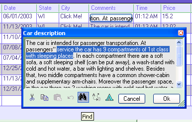
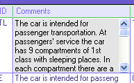
The RustemSoft DataGridMemoColumn gives you a useful Memo Field control, which presents an edit window when user selects a cell of the DataGrid Memo Column on .NET DataGrid. This provides a pop-up memo field editor that you can call from your code at any time to let users edit the text in a memo field.
|
 |
|
This Memo field editor provides more flexibility by updating the memo field to be used in a .NET DataGrid column.
The DataGrid Memo Column Memo field editor is useful for showing short document contents, like memos and emails.
The DataGridMemoColumn includes a cancel feature. If you click OK the changes made are sent back to the table. When you click on the 'x'-button in the upper right corner or Cancel button your changes will not be stored. You may hide the Cancel button by using the showCancelButton property.
When using the DataGrid Memo Column editor you are automatically provided with all general features, which any typical, contemporary word processor has.
|
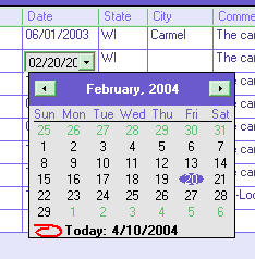
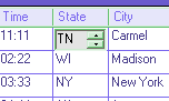
DataGrid DateTimePicker column Style
The DateTimePicker ColumnStyle is used to allow the user to select a date and time, and to display that date/time in your DataGrid.
|
 Syntax Syntax
DataGridDateTimePicker()
|
Syntax
DataGridDateTimeColumn(Format, DefaultValue, DelimiterChar)
Parameters
Format - Various formats may be set. You may use a date/time format (like MMDDYY, MMDDYYYY, DDMMYY, DDMMYYYY, YYYYMMDD, HHMM12, HHMMSS12, HHMM24, HHMMSS24) to enable the date/time inserting and updating. Default is MMDDYYYY.
DefaultValue - any DateTime value. For example, you can set the DefaultValue to today's date. Default is empty DateTime (null/Nothing).
DelimiterChar - a delimiter between date/time fractions (between days and month or hours and minutes). Default is "/".
|
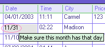
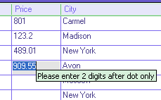
The DataGrid TextEdit Column TextEdit field editor is useful for showing short document contents, like Memos and emails.
The DataGridTextBoxColumn provides several events, that enables you interact the events in your code.
|
Syntax
DataGridTextEditColumn()
|
Syntax
DataGridNumericUpDownColumn()
|
Syntax
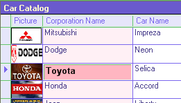
DataGridPictureColumn()
|
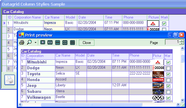
Obviously the DataGridPrint class is not a datagrid column style control. The service class is intended to help you to create a print output based on your datagrid content. The class has been included into assembly since it is build for .NET WinForms datagrid control and very helpful for your .NET datagrid design. It will help you to implement an application with a print preview and a print support.
The DataGridPrint class is used by the Print dialog and Print Preview dialog (on your .NET form) to draw the DataGrid object content that should be printed. An object of the class is used for a .NET PrintDocument object.
|
Syntax
DataGridPrint(PrintDocument1, DataGrid1, bBlackWhite)
PrintDocument1 - System.Drawing.Printing.PrintDocument reusable object that sends output to a printer
DataGrid1 - System.Windows.Forms.DataGrid object that content you are going to print
bBlackWhite - boolean parameter that defines if you like to use "Black and White" printing mode or you would like to send to printer the real coloring that your datagrid control has currently on your form.
|
|
|
|
|


 About Rustemsoft